Chapter 10 Reviewing Results
When the analysis completes, multiple result plots and tables appear below the central plot area.
10.1 Model selection (Optimal Number of Peaks)
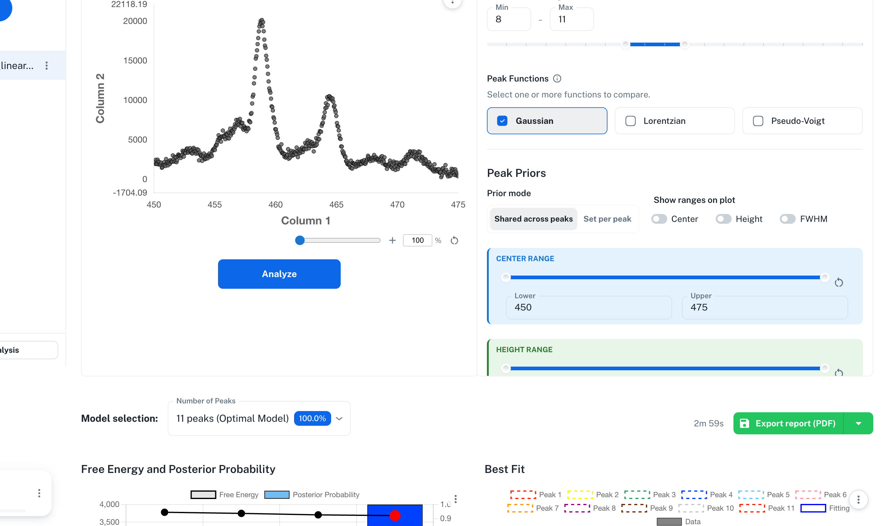
At the very top of the results area, a selector appears listing each evaluated model with its Posterior Probability. Models are ordered by the specified order of Peak Functions, then by ascending number of peaks.
Model selection: [ 10 peaks (Optimal Model) 99.9% v ]
- By default, the model with the highest probability (Optimal Model) is selected, and the subsequent plots are drawn for that model
- Switching to another model in the dropdown also updates the Best Fit and posterior displays to that model
- When multiple Peak Functions are selected, model names combine the function type and the number of peaks, such as
pseudoVoigt-10peaks(with a single function, the format is10 peaks) - When probabilities are close, it is useful to switch between the competing models and compare them
Important: Free Energy and Model Posterior Probability cannot be compared across the Height / Area intensity parametrizations. Comparisons are valid only among models evaluated within a single run using the same parametrization. Do not numerically rank Height results and Area results from separate runs.
The elapsed analysis time (e.g., 5m 31s) is shown on the right.
10.2 Free Energy and Posterior Probability (Top Left)
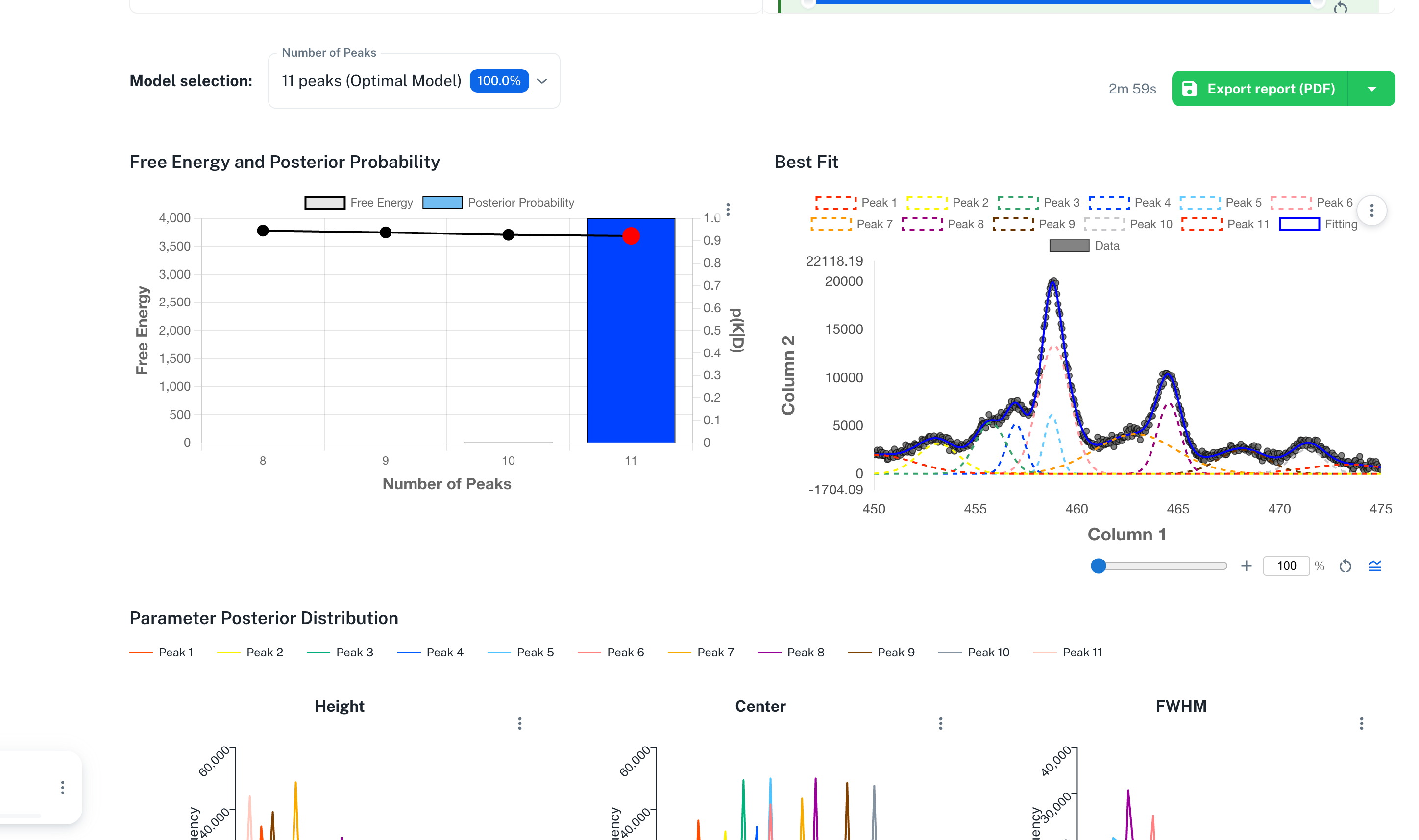
Displays the Bayesian free energy (line) and the posterior probability (bars) overlaid, for each number of peaks.
- Left Y axis: Free Energy (smaller means a better model)
- Right Y axis: \(p(K|D)\) (Posterior Probability, 0 to 1, summing to 1)
- Horizontal axis: Model. When multiple Peak Functions are selected, the combinations of function type + number of peaks are listed
In the legend, Free Energy is shown as a black line with a center dot, and Posterior Probability as a blue filled box. A red dot indicates the currently selected model.
The Best model is the model with the highest posterior probability. The Selected model is the one the user is currently displaying via the dropdown. They are usually the same, but you can select a different model for comparison.
10.3 Best Fit (Top Right)
Draws the fit based on the MAP-estimated parameters of the selected model on top of the spectrum.
- Gray points: observed data
- Colored dotted lines: each peak component (Peak 1 through Peak N)
- Blue solid line: the combined fit curve summing all components
- If an Offset (background) is set, it is shown separately as a dashed line
Operations
- Change the zoom level with the mouse wheel, linked to the
%slider at the bottom - Click legend items to toggle the visibility of each component
- Double-click legend labels to edit their names
- Double-click axis labels to edit their names
- Open Plot Settings from the gear button
- Toggle
0-base peaksto switch peak components to a zero baseline - Export a PNG image from the menu at the top right of the plot
- If a Y Range is manually specified in the Data tab, the same Y-axis display range is also applied to the Best Fit plot
Tip: 0-base peaks is a display toggle. It does not affect the numerical analysis results.
10.4 Parameter Posterior Distribution (Middle)
Displays three side-by-side posterior distribution histograms of Height or Area / Center / FWHM for each peak of the selected model. In results with the Area intensity parametrization, the intensity histogram is displayed as Area (\(S\)).
- Horizontal axis: parameter value
- Vertical axis: Frequency
- Color-coded per peak (legend
Peak 1,Peak 2, ...Peak N)
Depending on the settings, the following distributions are also displayed.
- For pseudo-Voigt: Mix Ratio for Height results, Mix Ratio (\(\eta_A\)) for Area results
- When the Offset is estimated with Linear / Shirley: Offset Left / Offset Right; when estimated with Constant: Offset Constant
- When the Noise is estimated with Gaussian: Noise Parameters (\(\sigma\)); with Modified Gaussian: Noise Parameters (\(\sigma_0\) / \(\sigma_1\) / \(\sigma_2\))
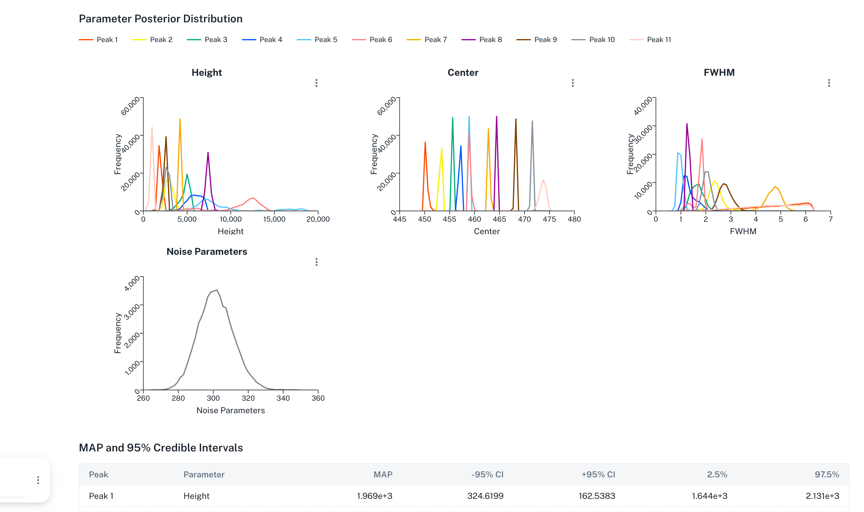
Tip: A sharply peaked histogram indicates that the parameter was determined with high precision. If a histogram is broad, the uncertainty is large; consider increasing the number of samples or revisiting the prior range.
10.5 Error Function Trace (CPU Version Only)
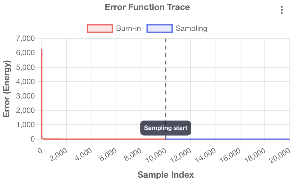
Displays the evolution of the energy (error function) during the sampling process. It is used for convergence diagnostics.
The Error Function Trace plot is not displayed in the GPU version. If you are unsure about convergence, increase Total samples or revisit the prior range and Peak search range, then rerun the analysis.
The following content is displayed only in the CPU version.
- Horizontal axis: Sample index
- Vertical axis: Error Function (smaller means a better fit)
- Red: burn-in period
- Blue: sampling period (used for posterior distribution collection)
- Dashed line
Sampling start: the boundary between burn-in and sampling
What to Check
- If the energy values in the blue region are nearly constant, the run is converged
- If the blue region fluctuates strongly or keeps trending downward, judge the run as not converged
- If not converged, increase
Total samples, revisit the prior range, or narrow the number of peaks or the search range, then rerun the analysis
Exchange Rate Warning (CPU Version Only)
If Exchange Rate Warning appears in the CPU edition, consider increasing Number of Replicas and rerunning the analysis. The warning is also included in PDF / Word reports.
10.6 MAP and 95% Credible Intervals (Table)
At the bottom, a table shows the MAP estimate (the mode of the posterior distribution) and the 95% credible interval for each peak parameter. The credible interval is a Bayesian statistics term: the range between the 2.5% and 97.5% percentiles of the posterior distribution (its interpretation differs from a frequentist confidence interval).
| Peak | Parameter | MAP | -95% CI | +95% CI | 2.5% | 97.5% |
|---|---|---|---|---|---|---|
| Peak 1 | Height | ... | ... | ... | ... | ... |
| Peak 1 | Area (Area mode) | ... | ... | ... | ... | ... |
| Peak 1 | Derived Height (MAP) (Area mode) | ... | — | — | — | — |
| Peak 1 | Center | ... | ... | ... | ... | ... |
| Peak 1 | FWHM | ... | ... | ... | ... | ... |
| Peak 2 | Height | ... | ... | ... | ... | ... |
| ... | ... | ... | ... | ... | ... | ... |
| Noise | \(\sigma\) | ... | ... | ... | ... | ... |
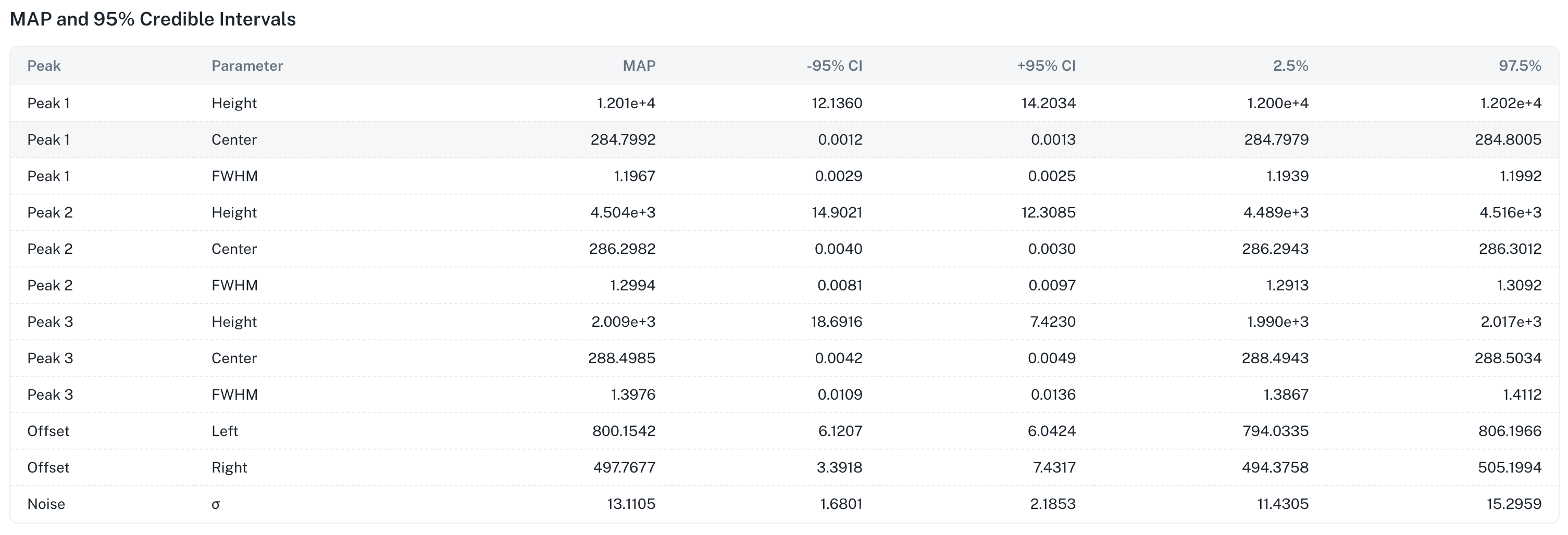
- MAP: the mode of the posterior distribution (Maximum A Posteriori) - a point estimate
- -95% CI: the distance from the MAP down to the 2.5% percentile (lower end) (MAP - 2.5%)
- +95% CI: the distance from the MAP up to the 97.5% percentile (upper end) (97.5% - MAP)
- 2.5%: the lower end of the 95% credible interval (absolute value, the 2.5 percentile of the posterior distribution)
- 97.5%: the upper end of the 95% credible interval (absolute value, the 97.5 percentile of the posterior distribution)
Area results do not output the usual Height rows; instead they display the MAP and 95% credible interval of the directly estimated Area (\(S\)). The Derived Height (MAP) row is a reference value obtained by converting the joint MAP point in Area space to Height; it does not represent a marginal posterior distribution or a credible interval. The pseudo-Voigt mixing ratio is likewise the posterior distribution of \(\eta_A\).